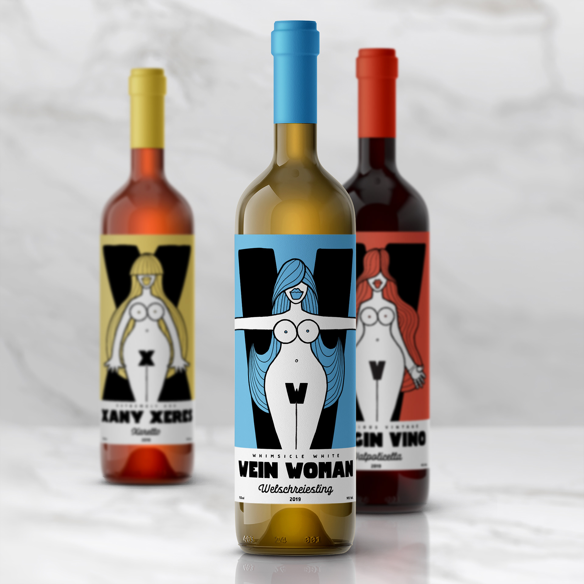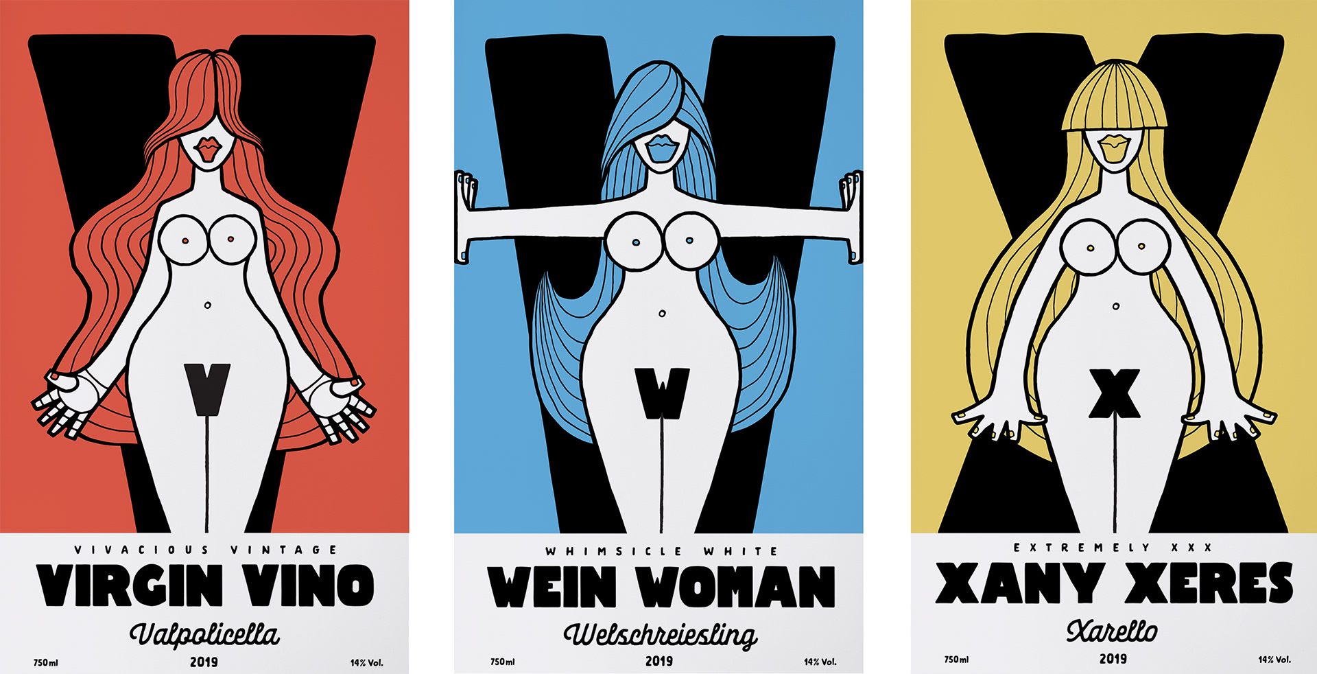

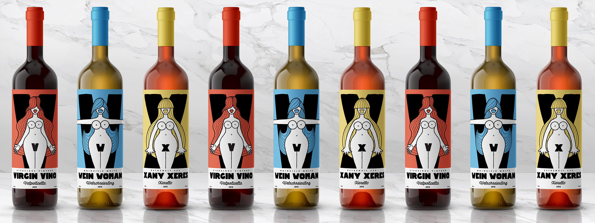
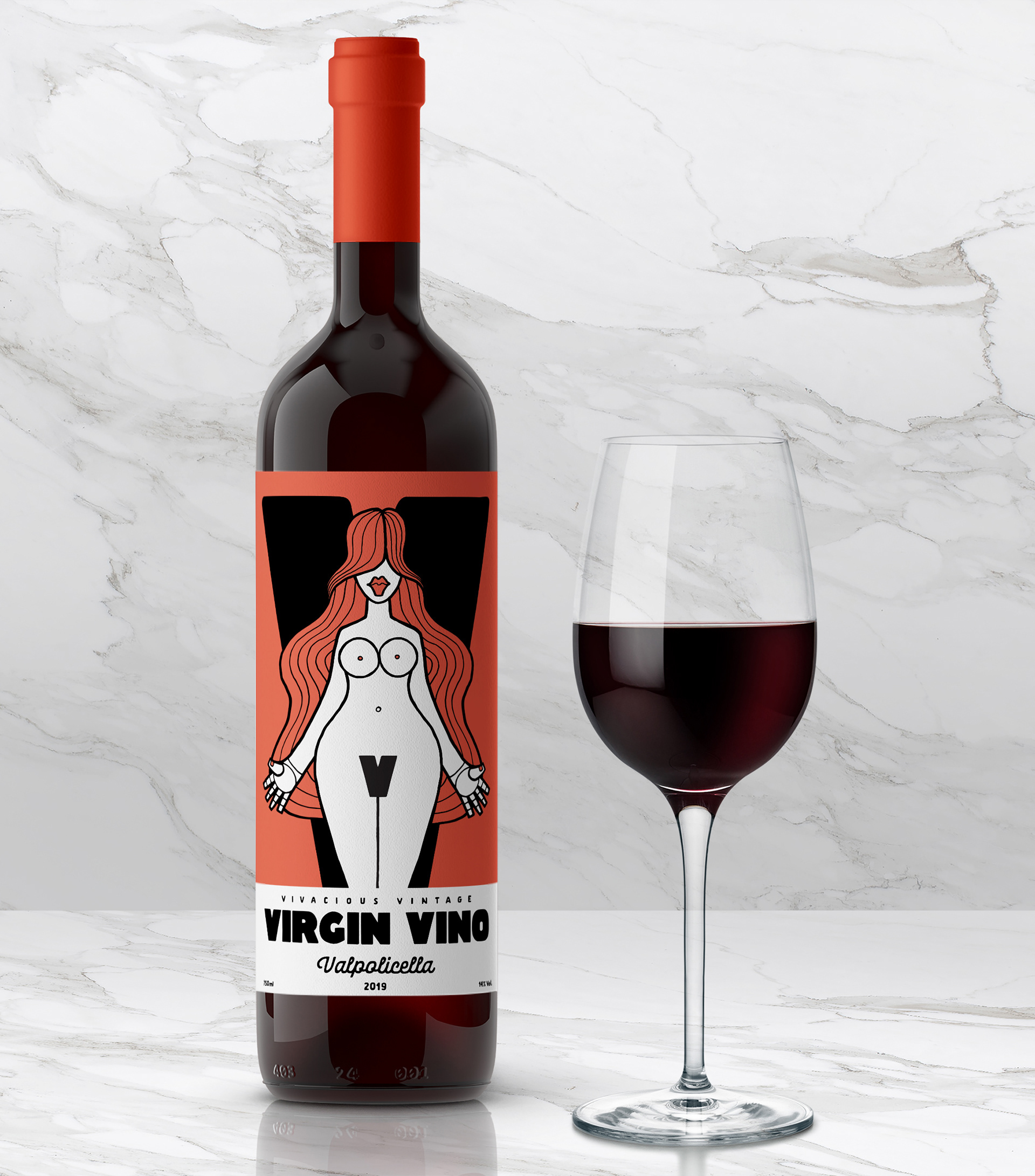
Bottle labels for an imaginary wine brand - Voluptuous Vino. A red - 'Virgin Vino', a white - 'Wien Woman' & a rose 'Xany Xeres'. Designs all centred round curvy female forms & using only alliteration as the names & information on the typography. I had a lot of fun coming up with these!
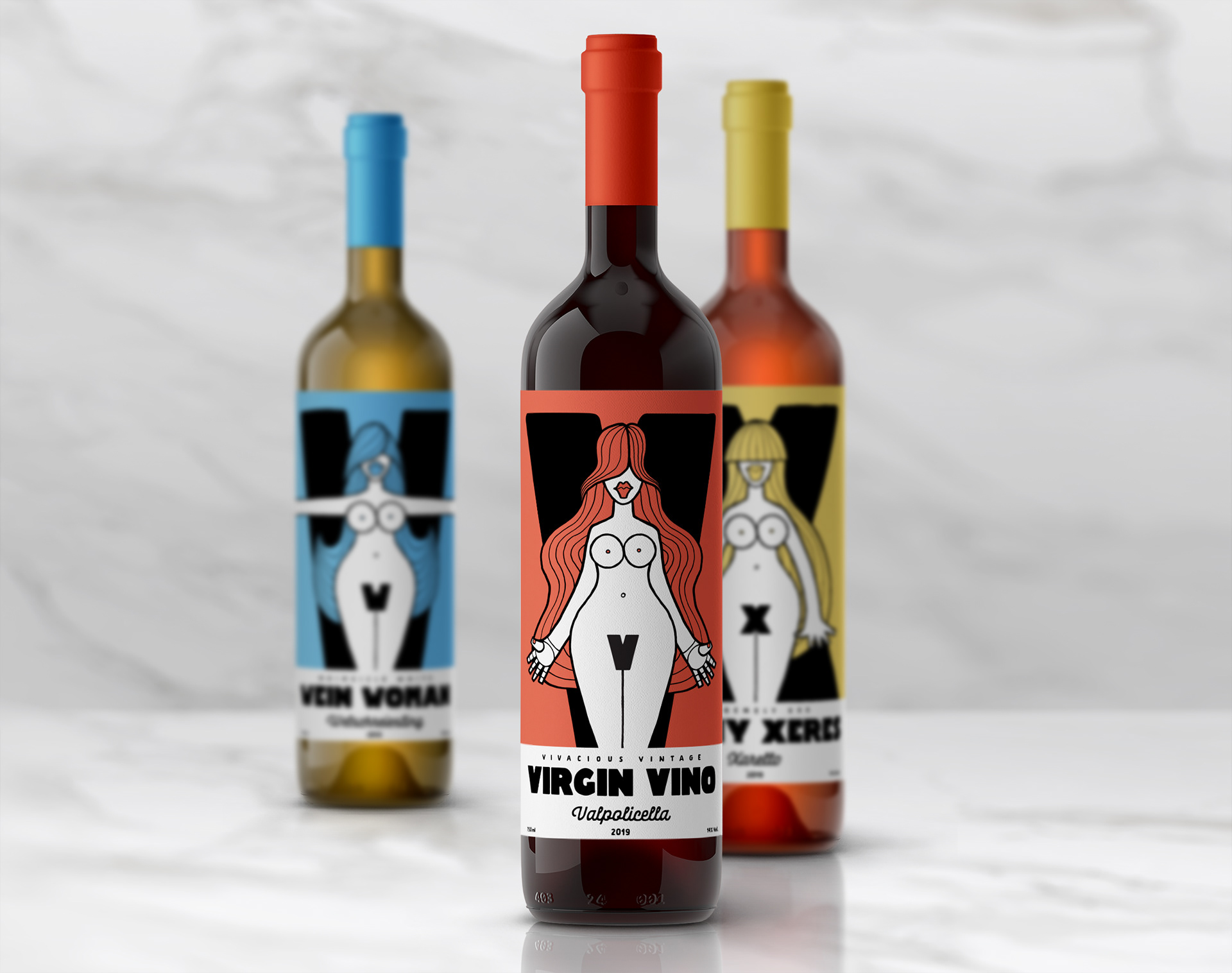
Part of the 36 days of type challenge, where designers are invited to create a different letter of the alphabet for each day of the contest. For V,W & X - I decided to focus my designs on packaging in the form of wine labels based on the female body.
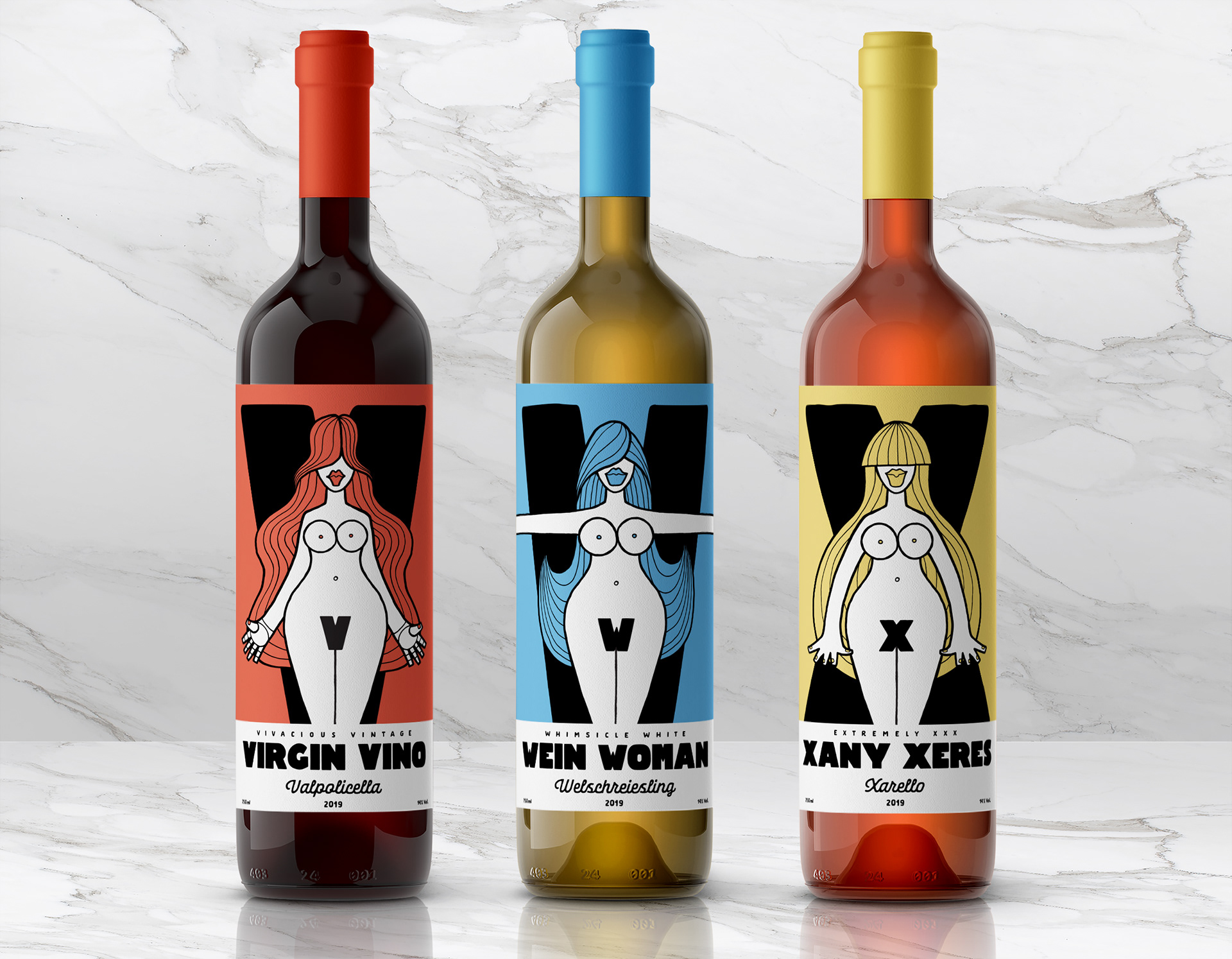
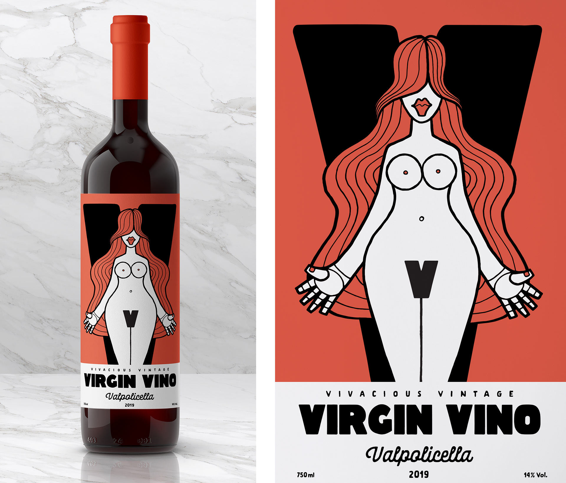
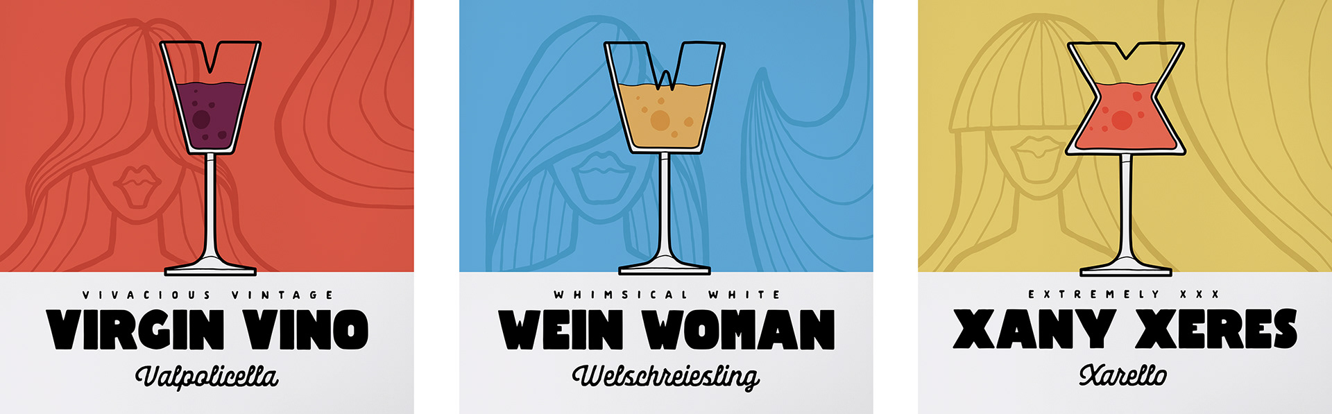
Virgin Vino - V is for Vino. A Vase of Vintage Valpolicella or Verdejo? Vamos! .... Also for Very Vivacious Virgin with a Voluptuous Vajajay! Vaguely Vulgar? Verywell - Vine me!
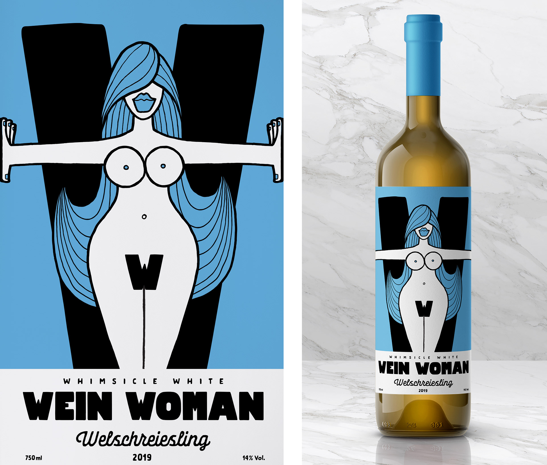
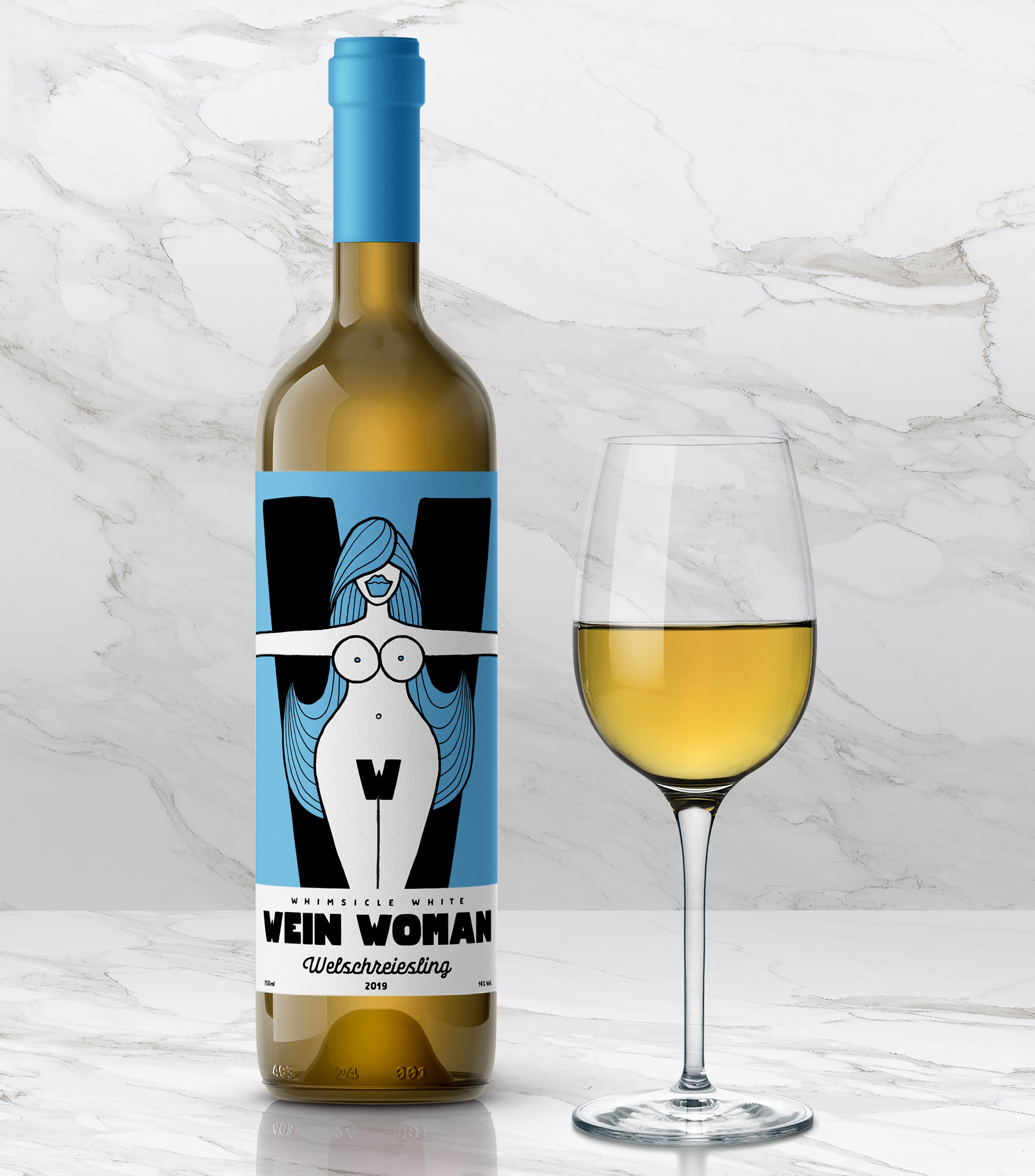
Wien Woman - W is for Wine.‘Wine’not?! A Wonderful White Welschreiesling or Wessbugunder ( Wein ja? Wunderbar! )... & for Wildly Whimsicle Woman With ‘Weiner Wagon Wig’ - Wow!? What a Way to spend a Wednesday!
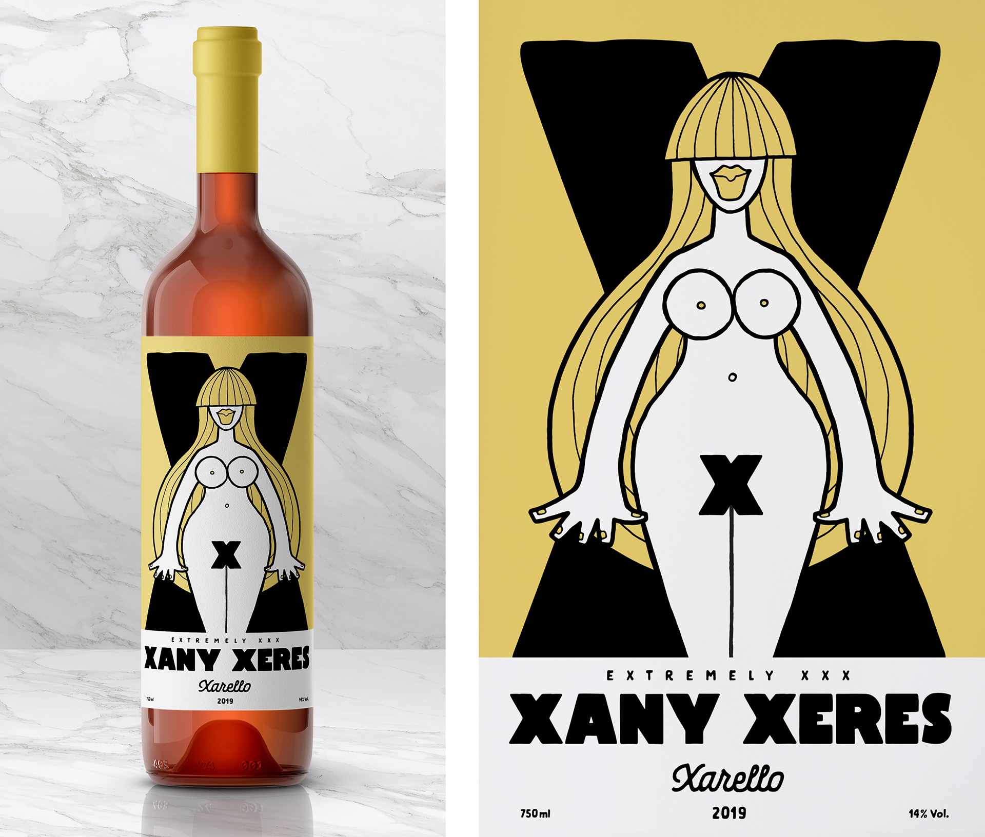
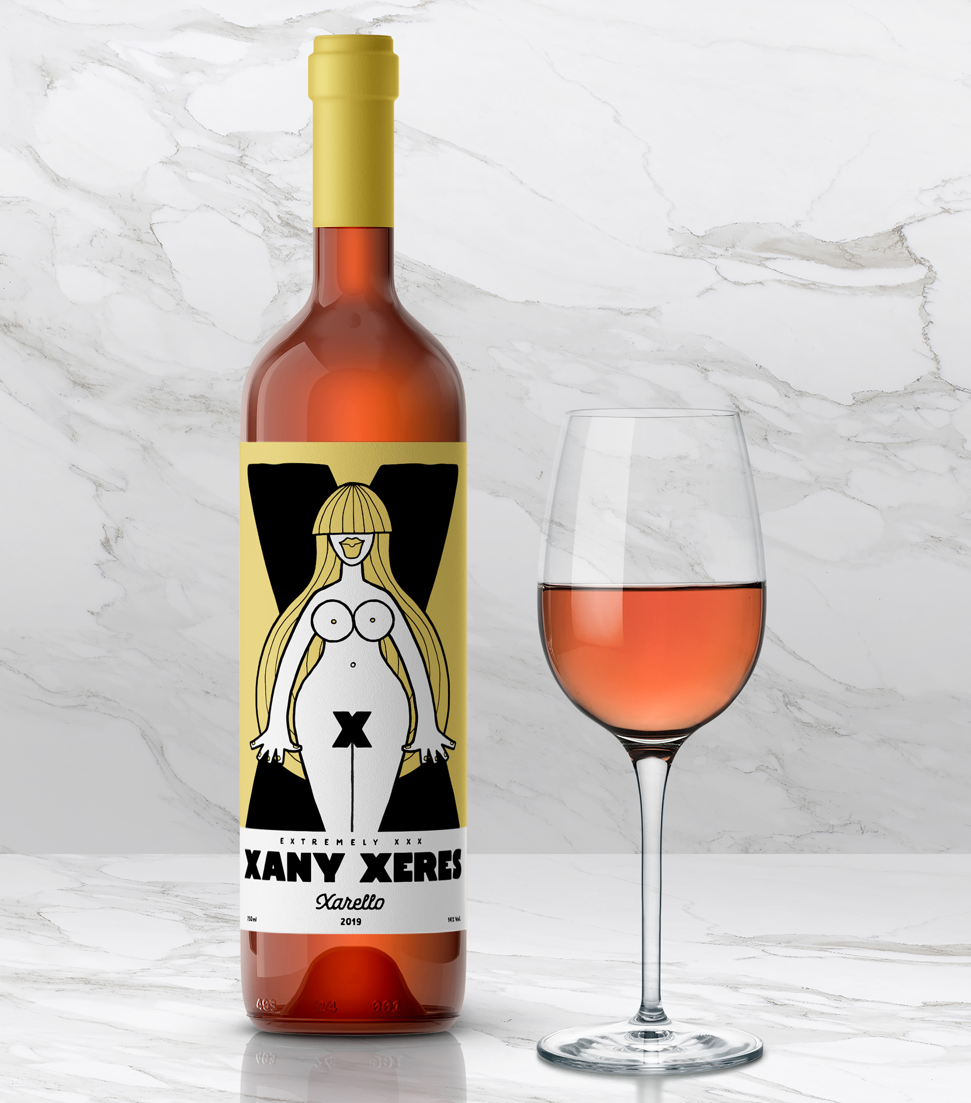
Xany Xerex - X is for Xeres... ‘com un Xut de Xocolata’... Xarello grapes & Xany Xoanon or Xiqueta, XXX Xenophilia anyone?
Alternative development designs where the letters take the form of wine glasses. Though these are still fun and present the letters in an illustrative form, overall I think using the letters as part of the female anatomy was much more fun and successful.